Looking at some real data1 in Allocate, Allovue’s tool for resource allocation modeling. Two different funding formulas, with a total cost with in 0.5% of each other. Look at the swings on a per-school basis.
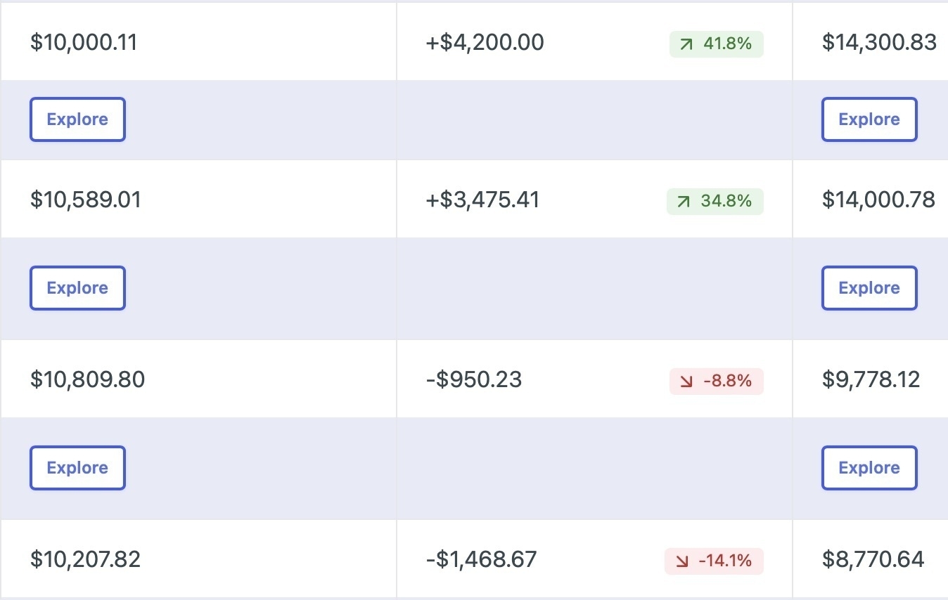
Without reviewing results, both models seem like reasonable choices. The variance is astonishing.
-
If you’re wondering why the math is all wrong, that’s because I didn’t want to show actual district data. I edited the DOM to fudge all the numbers to ensure that I was not revealing any privileged, private, or identifiable data while accurately representing a real situation. ↩︎